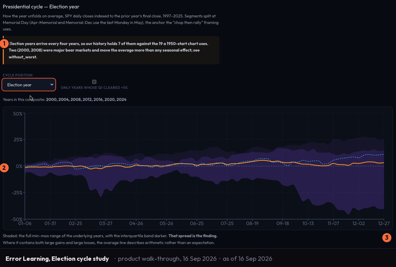
This matters because most seasonality claims circulate without it. "The third Friday of the month is bullish." "End-of-month sessions run higher." Each of those is a claim about an average. The average might be real. It might be three data points. You cannot tell from the headline, and the headline is usually all you get.
What a sample size tells you that a mean does not
Every average has a distribution underneath it. A large sample compresses that distribution - the error bar around the mean tightens, and the mean becomes a more reliable description of what actually tends to happen. A small sample leaves the distribution wide open. The error bar stays broad, which means the mean could shift substantially with only a few more observations.
The error bar is not a hedge. It is specific information. A wide error bar tells you the data does not yet resolve to a reliable pattern at this cell. A narrow error bar tells you the pattern is stable across the sample. Both are actionable reads - one toward patience, one toward attention. Collapsing them into a single colour on a heat map discards the most important dimension.
The correct way to read a seasonality cell is to look at three numbers together: the directional average, the sample count, and the error bar. Read only the average and you are reading less than half the information.
Two dates can share the same average and deserve different confidence
Here is the logic that matters most when you are comparing cells.
Take two dates with identical directional averages. One is built from a large pool of observations - sessions spread across decades, consistent enough that the error bar is narrow. The other is built from a small pool - fewer historical instances, the kind of cell that appears when you cut the data along multiple dimensions simultaneously. Same number in the mean column. Completely different reliability.
When you read only the mean, you treat them as equivalent. They are not. The first has been tested more times and survived. The second is a hypothesis that has not accumulated enough evidence to confirm or deny itself. Weighting them identically is a method error, not a trading decision.
The discipline is to see the difference before you form a view.
Why more dimensions shrink every cell
A seasonality study that analyses 30 years of sessions by calendar day alone gives each day a large, coherent pool of observations. Add a second dimension - say, session behaviour by ATR regime - and you have split the pool. Add a third - gap behaviour - and you have split it again. Each additional cut produces more granular cells and smaller samples inside each one.
This is not a flaw. It is the correct constraint to surface. More dimensions mean more specificity, and specificity has a cost in sample depth. A well-constructed seasonality surface shows you both: the more precise read and the smaller pool that produced it. The error bar widens as the cell's sample shrinks. That widening is the surface telling you something true.
The problem arises when the surface hides the constraint - when it shows you only the directional average and lets you infer a precision the data does not support. Showing the sample size and error bar alongside every cell is what prevents that inference. It limits what the display implies to what the statistics support.
The same logic runs through pair-trading research. When a cointegration test fails, the correct response is to say so and cap the implied confidence accordingly - not to present the output as though the test had passed. The constraint is the information.
Read the cell, not just the colour
The practice that separates a research tool from a heat map is whether it shows you all three numbers. A directional average coloured green is not evidence. A directional average coloured green, with a sample count that supports it and an error bar narrow enough to make the average meaningful - that is closer to evidence.
Error Learning on Vulcan Trading surfaces 30 years of S&P sessions by calendar day across more than 14 breakdown dimensions. Every cell carries its sample size and error bar alongside the directional average. The methodology does not hide the constraint when the sample is thin. It displays it.
That is the discipline. When you read a seasonality cell, read all three numbers. The average tells you what tended to happen. The sample size tells you how many times. The error bar tells you how much to trust the average as a description of what will tend to happen next. None of the three is optional. Start free at vulcan-trading.ai.